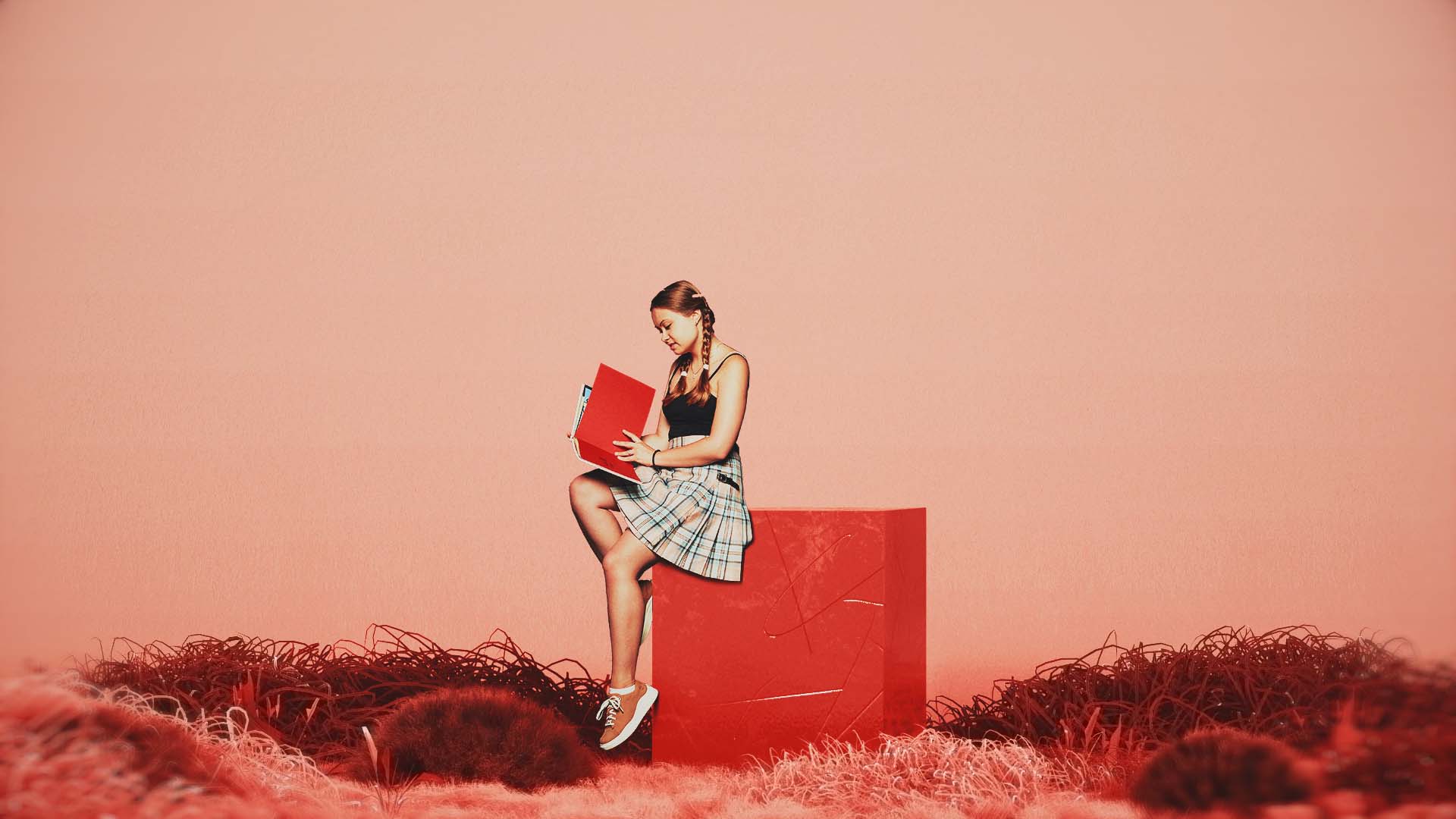
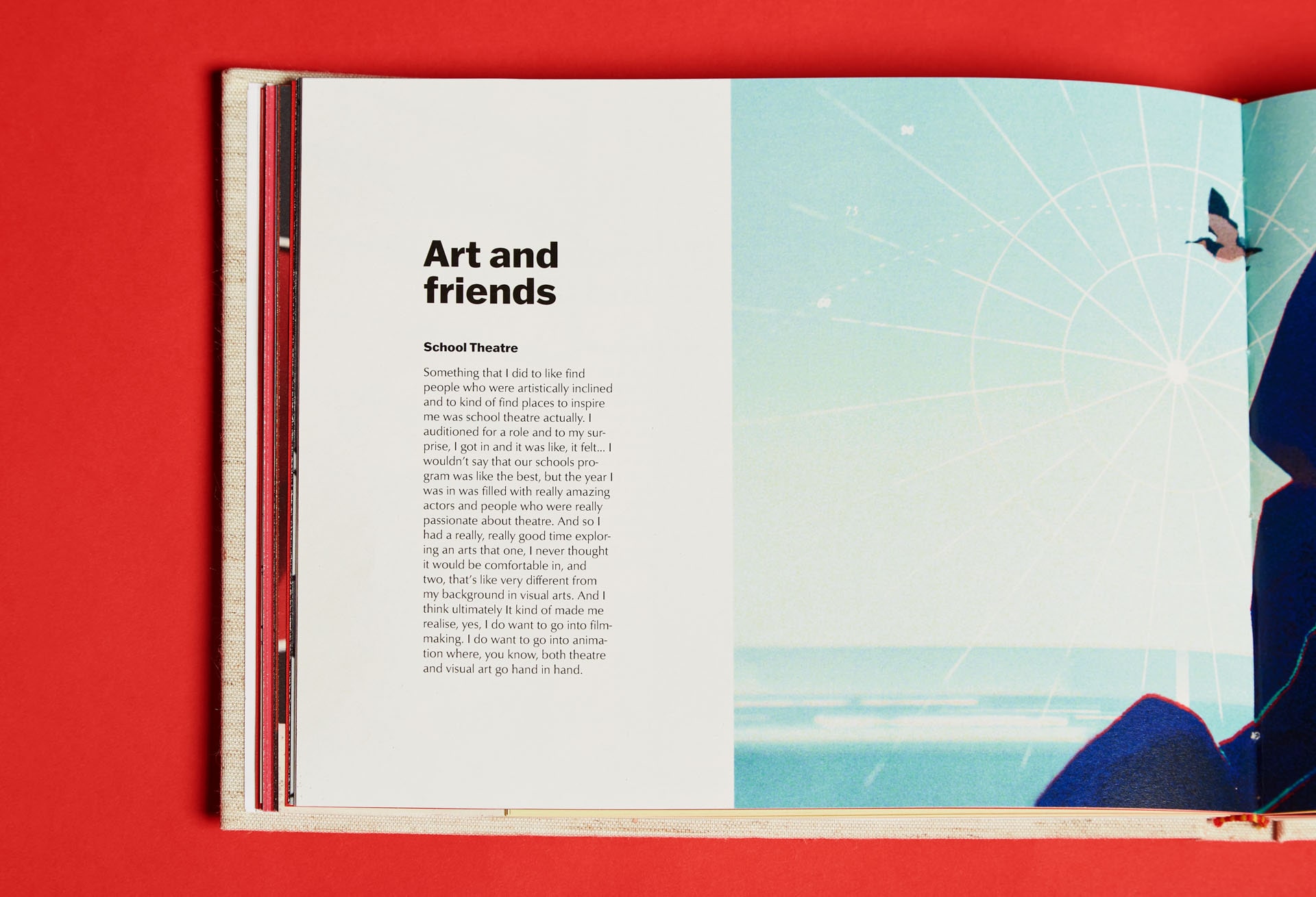
Brand strategy was an important consideration in this project. The book was designed to be a biannual publication showcasing the top students in different creative disciplines from around the world. It had to be a platform that was prestigious and gave space for the artist to talk about themselves and their work. During the creation of this book, I was able to connect and work with 5 very talented creatives and interview them about their experiences.
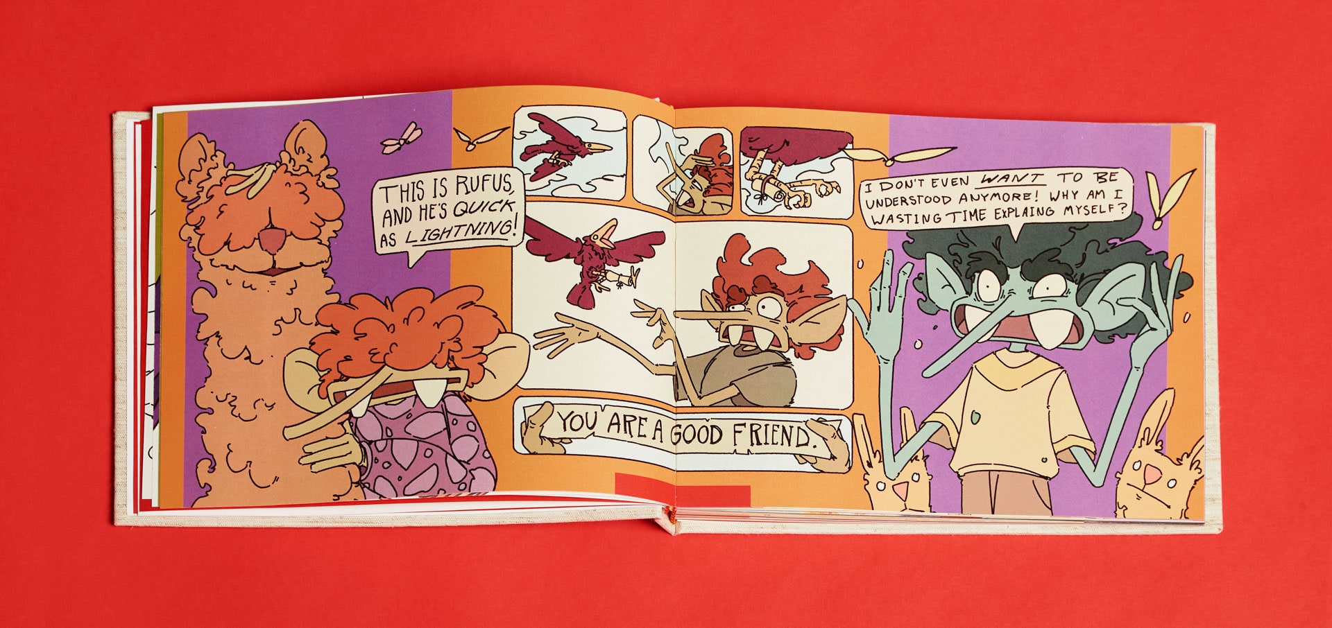
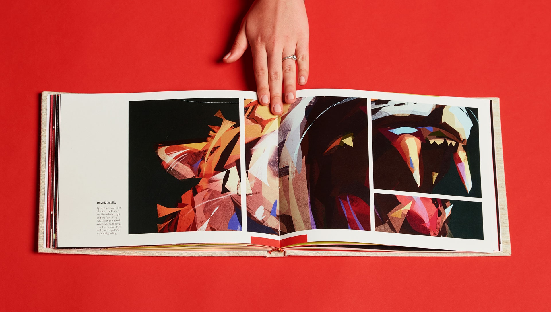
As the purpose of the book is to honor and pay respect to the hard-working students who get featured, it is only right that the grid layout, image treatment, and typographic styling are modified to best suit the content of each artist. Graphic treatments that work with a comic illustrator will vary from a realist painter. The alternate solution was to settle for a more generic, repetitive, and ultimately less personal formatting of images, however, this would be off-brand and fight against the goal of the art book.
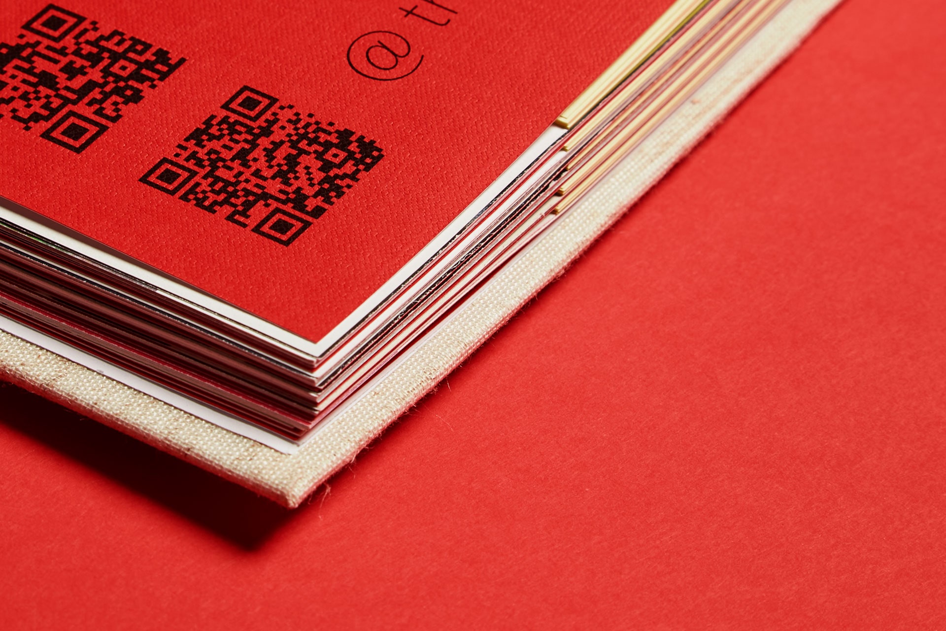
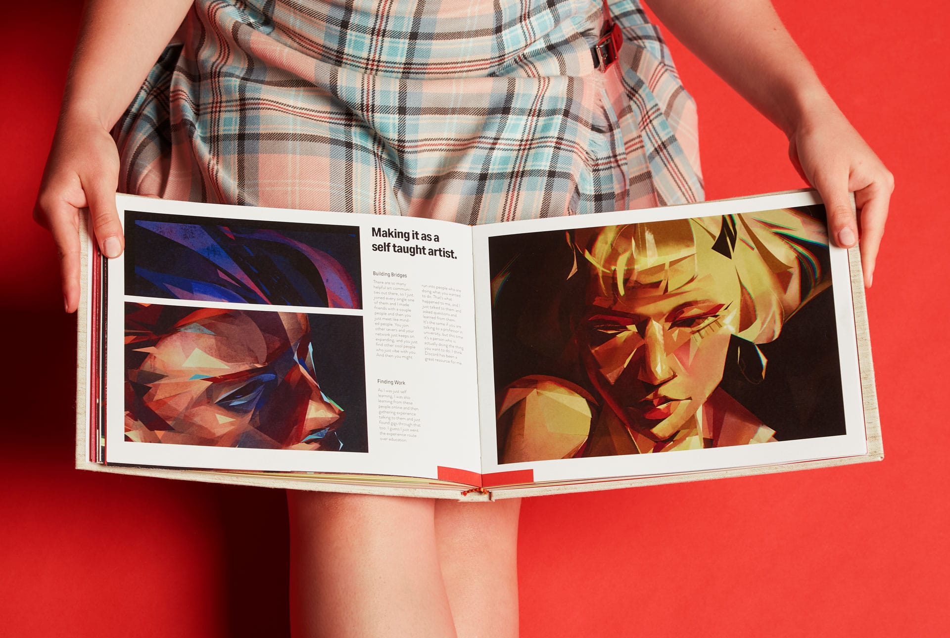
The title spread is intended to feel like a red carpet, and greatly influenced a lot of the brand language for this project. When a student is featured, they are given a whole spread. This is a deliberate choice and a sign of respect. On top of that, the textured paper conveys a feeling of luxury to the reader, and was supplied by famous Italian paper store, "Paper and People".

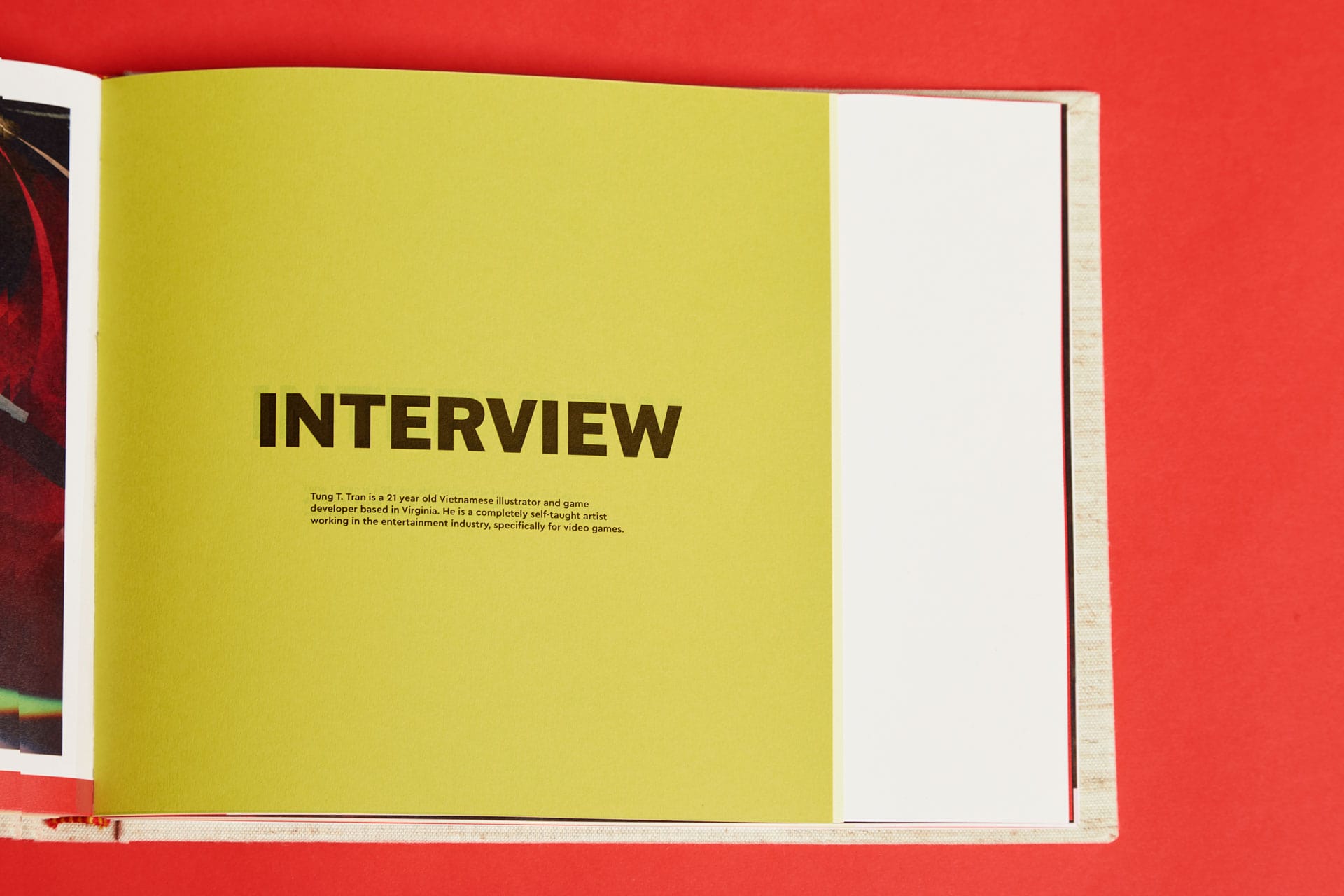
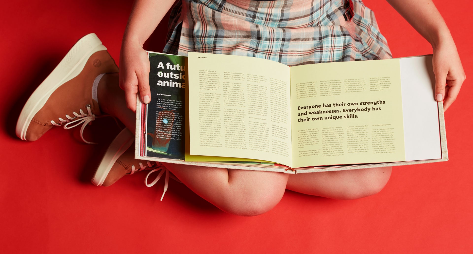
The interview section is cut into a smaller square format, which is intended so that the readers can visually distinguish between the art and the interview sections, and navigate past it if they choose to. The four-column text block approach is intimidating and invites only the very interested reader to go through it. A green, textured paper is used for the interview cover, while a more gentle, yellow-hued paper is used for the interview contents. A selection of quotes is displayed among columns of unfiltered conversation, including spoken imperfections. The interviewer's speech is in an italic-indented font variant.